An introduction to using Craft Docs for note-taking as an academic
Note-taking is an essential part of being an academic. There are literature notes, meeting notes, presentation notes, project notes, and the list goes on. How do we keep it all organized, connected, searchable, and even enjoyable? For me, Craft Docs has met all of the aforementioned criteria. In the last year of my PhD program, Craft Docs helped me keep up with my dissertation research, manuscript submissions, and postdoctoral job interviews. Having a central space to easily process my most important notes kept me organized and (generally) level-headed during one of the most stressful periods of my life. There are three defining features of Craft Docs that made my last year of graduate school a manageable one: 1) cross-platform capability, 2) beauty and usability, and 3) ease of connection via backlinks. Throughout my dissertation year, each of these features allowed for an efficient and pleasant note-taking experience.
Cross-platform capability: access to notes on any device
Project or manuscript ideas may occur at any time. For example, during a walk, I may need to jot down an idea about debugging code for a particular project. At times like these, my macbook is not immediately available, but my phone is normally somewhere near. Craft Docs is available and fully functional on iOS, iPadOS, and MacOS, making all of my academic notes accessible on any platform.
Moreover, any changes between devices are automatically synced across devices. If I make a change to a note on my iPhone, the note on my macbook and iPad will reflect those changes almost immediately. The fluidity of the note-taking experience from one device to another removes all worry that notes will be improperly integrated.
In addition to seamless sync between devices, Craft Docs works offline for any typed text (but there are limitations with media and external files). It is not dependent upon an internet connection. This feature comes in handy when traveling or while working outdoors where wifi may not be available. Thus, Craft Docs makes changing work environments simple, as it is always accessible.
Beauty and usability: Craft Docs just works and looks good while doing it
Both aesthetics and functionality are important in a note-taking app. Some of you may wonder why anyone would care how the notes look. Personally, I’ve struggled with note-taking apps in the past because I hated how they looked and went to great lengths to fix them. With Notion, I made several databases, columns, and workspaces in an attempt to streamline my note-taking process. I was never satisfied with it. Similarly, with Roam Research, I endlessly tinkered with CSS code to build my ideal note-taking database. Long story short: it never worked.
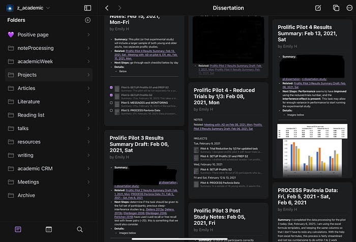
Differing from most note-taking apps, Craft Docs is beautiful right out of the box. I can see a gallery-based overview of my notes in a way that is uncluttered and automatically organized. I no longer spend hours playing around with and structuring notes. Instead, I am now able to direct the majority of my focus on the idea, not on customizing the aesthetic of my system.

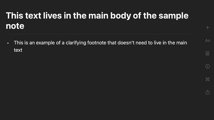
This is not to say that Craft Docs isn’t customizable. However, the customization is not to the degree of other major note-taking apps. It is not so modifiable that it kills productivity. Specifically, in Craft Docs, one can change the overall appearance of her database. For example, users can choose either light mode or dark mode and the accent color of the text. The formatting features allow for bulleted lists, numbered lists, or toggle lists where text can be folded underneath toggles (see examples below). An interesting formatting feature in Craft Docs is grouping. The grouping function allows users to group several blocks of text into their own page or add text beneath a heading in a page (sample note below). I have found this useful for adding clarifying information that is not particularly necessary for the main text. In my note-taking workflow, grouping is a means of adding a sort of “in-line footnote” that can complement the text in the body of the note (example below).


Taking notes in Craft Docs is a simple and enjoyable experience. All notes are entered in blocks, which makes it easy to move text around if needed. For example, if you are drafting a long note and find that a section of text may read better if it were presented earlier in the document, you can simply drag that text to the desired location instead of having to copy and paste it. Moreover, Craft Docs deals with long notes quite effortlessly. There are rarely slow load times or app crashes because of long notes.
One of the most useful features that I’ve found in Craft Docs is the ability to drop any kind of media directly into Craft. This includes images, Microsoft Excel files, Microsoft Word documents, etc. I often add research method images in my literature notes when writing article summaries. I sometimes add screenshots of text snippets from the original article or handwritten notes directly using Craft or pulled from other apps (e.g., Goodnotes). Having all of the reference material in the same app helps me to stay focused and organized. I don’t have to go through my files system or visit other apps when looking for information about a particular article or project. It all lives in the same space where I can easily find it.

Craft Docs allows for hierarchical, folder-based organization. Although I will mention my use of backlinks (i.e., folderless grouping and connection), I still subscribe to this hierarchical system for high-level organization. For example, I have a specific folder for research article summaries, a folder for meeting notes, and a folder for project notes. This type of organization helps me to visually see the structure of my notes and to have a designated place for each type of content.
Extensive subfolder organization is arguably unnecessary, as Craft Docs has good search capabilities. Search can be done in three different ways: 1) in the dedicated search tab, 2) the pop-up window, and 3) within a given document. It should also be noted that Craft Docs does not currently search within handwritten drawings or media files. Thus, any handwritten note or pdf file will not come up in the search (as of the publishing date of this article). Nonetheless, Craft Docs is both a beautiful and functional app that should be easily navigable with basic, high-level organization. Because Craft allows for hierarchical structuring and backlinks, I think that it is perfect for taming the jungle of information consumed by students and academics.
Connection via backlinks: simple linking between notes
Backlinks in Craft Docs allow for connections between notes. Linking notes adds reference material for each note and gives it context. If I am writing a summary of an article that focuses on sleep quality, I may add sleep quality as a backlink within that note (by highlighting the word “sleep quality” and selecting the @ symbol). That way, I will be able to see each article that mentions sleep quality on a dedicated page to sleep quality. With additional articles, I may continuously update my core notes about sleep quality as a concept.
Backlinks also reduce the need for multiple subfolders to organize information. For example, if I am working on a manuscript revision, I might have one note that details queries from the editors and reviewers. This note will live in a folder for its designated project. However, while working on the revision, I will likely generate several other notes related to the manuscript revision, especially meeting notes, which live in the “meetings” folder. When I meet with other authors on the paper, the manuscript revision may be one of several topics that we discuss, and it will be placed in a block of text within the meeting note. With backlinks added to the block of text regarding the manuscript revision, I will have a linked reference at the bottom of the page (e.g., “@Links To This Page”) for the original manuscript revision note that refers to the specific block of text in the meeting note (see example below for linked notes). Thus, I can connect relevant information from my meeting to the specific manuscript revision document, and there is no need to create additional folders to keep the information in one place. The backlink effectively organizes the information for me.

One of my favorite ways to use backlinks in Craft Docs is to build an “academic relationship manager or ARM” of sorts. This allows me to connect the people with whom I interact to various meetings, papers, and projects. For example, over the past year, I interviewed with several academics for a postdoctoral research position. I was able to effectively prepare for these meetings by linking each researcher to her papers, presentations, trainees, and any previous meetings that I had with the potential mentor. Thus, when it was time for me to prepare for any meeting or interview with an academic researcher, I would refer to her page in Craft Docs to review the information that I had about her. Having this system helped me to reduce some of my meeting anxiety, as I was able to quickly and adequately prepare for important interviews. Because of this, I partially attribute my success of securing a postdoctoral position to having a good note-taking system in Craft Docs.
Should You Use Craft Docs?
I give Craft Docs my highest recommendation for academic note-taking in the Apple ecosystem. Whether it will fit into your workflow or not is up to you to decide. Luckily, Craft Docs often offers promotional discounts to students and academics. As of the publishing date for this article, Craft Docs is free for students, professors, and academic faculty. You can find a link to the Craft Docs site here. Whatever you decide to use for your notes, I wish you a fluid, functional, and fun note-taking experience!
Originally published at https://www.emilyhokett.blog on August 17, 2021.
